IELTS bar chart model answer for writing task 1 October 2018
This bar chart appeared in IELTS writing task 1 this month. The model answer below will help you understand how to organise your ideas and support your statements with data. Also check the 10 useful tips below to help you understand the model answer better.
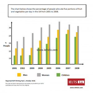
You can download the bar chart above here: IELTS Writing task 1 October 2018
IELTS Model Answer Writing Task 1 Oct 2018
The bar chart illustrates the proportion of women, men and children consuming five servings of fruit and vegetables each day in 8 years from 2001 to 2008 in the UK.
Overall, it can be seen that the highest percentage of all people consuming fruit and vegetables was women, while children consistently accounted for the lowest proportion. Furthermore, a significant increase in the proportion of people eating these food items can be seen over the period given.
The percentage of women who ate fruit and vegetables started at just over 20% in 2001. This figure then rose steadily to reach a peak of almost 35% in 2006, before falling slightly to 30% in the final year.
In terms of men and children eating fruit and vegetables, the rate remained relatively stable in the first three years (about 17% and 12% respectively). From this point, the proportion of men climbed gradually to peak at about 27% in both 2006 and 2007, after which it dropped to about 26%. A similar growth in the figure for children was evident reaching 25% in 2007 and around 24% in the final year.
Tips for Analysing the Model Answer:
- Paraphrasing does not need to be complicated. Not all words can be changed all the time. Choose which words you will and won’t change. Trying to paraphrase too often will result in too many errors and a lower score.
- Highlight highs, lows and trends in your overview where possible.
- Make sure statements in your body paragraph are supported by data.
- Make sure paragraphs are easy to see.
- Remember this is a report, not an essay
- Look at the logical organisation of information in the model answer above. It is easy to read and not confusing. If your report is confusing to read because you jump about with information, it is a bad report. All reports should be logical and clear.
- Check the linking words used.
- Note the variation in sentence structures.
- Don’t overload your report with too many small details – be selective.
- Aim for around 170-190 words. This model answer is 184 words in length. You do not need to write your word count on your test paper.
I hope you found this useful. For more tips and lessons, go to the RED BAR at the top of the website and see the relevant section of the test.
Please note, GT candidates have a letter in task 1 and nothing else.
All the best
Liz


Thank you, Liz, for your detailed explanation n how to attempt this task. I really appreciate it. In the meantime, I’ll appreciate your view on the below task. I’ll also appreciate comments from friends here. Thank you.
The bar chart describes the daily consumption of 5 categories of fruits and vegetables by men, women, and children in percentage for 8 years from 2001 to 2008 in the UK.
Overall, the highest proportion of those who consumed the food items throughout the period of 8 years were women as compared to children which are the least. Furthermore, a significant increase in the proportion of men, women, and children who consumed the food items was observed over the given period.
Within the span of 6 years (2001 and 2006), a significant increase in the consumption of food items by women was observed from around 20% to 35%. Afterward, a decline was observed for the remaining two years (2006 to 2008) from around 40% to 30%.
Additionally, a constant proportion of children and men who consumed fruits and vegetables was observed for the first three years (2001 to 2003) at about 12% and 17% respectively. Afterward, a significant increase was noticed for the next four years (2004 to 2007) at around 12% to 25% and 22% to 27% with a slight decrease to around 23% and 25% in 2008 for both children and men, respectively.
Hello Liz.
First of all I’m very glad for your efforts to make others beneficial and thank you so much .
everyone is using “illustrates” in introduction or in paraphrasing the given content in graph. Can we use “encapsulate” instead of ?
IELTS Writing Task 1 is a report. This means language is formulaic and suitable for report writing. The word “encapsulate” is less appropriate then “illustrates”. You do not need to change the word to get a high score. As I said, this is report writing and you will all use similar words – the question is … will you use them correctly and in the right context.
Hi Liz,
Please guide my passage below and please rate it in bands.
The chart illustrates the proportion of three kind of people (men, women and children) consuming 5 portions of fruit and vegetables per day in UK in 8 years from 2001 to 2008. The proportion of people is counted in percentage.
Overall, the women consumed highest portions than men and children in given time period. In contrast to that, the children consumed least portions compared to men and women. The proportion of all three kind of people is increasing in given time period.
In 2001, above 20% of women were consuming which gradually increasing above 30% in 2006. Like-wise in men and children, they were at above 15% and above 10% in first three year which increases to above 25% and just under 25% in year 2007. There is slightly difference in increasing percentage between all three kind of people.
In contrast to that, in year 2007, the proportion of women consuming decreases to just above 30% and in last year (2008) it gradually deceases to approximately 30%. Likewise in proportion of men, it gradually decreases to approximately 25% and the proportion of children decreases to under 25% in 2008.
The bar chart illustrates the amount of people who ate fruits and vegetables 5 times each day in the UK between 2001 and 2008. The figures were divided into 3 sections indicating different sex (women and men) or age (children). The data was given in percentages.
Overall, the percentages of consumption of 5 portions of fruits and vegetables increased in each section over the given period except the last two years of a slight decrease.
In terms of women’s consumption, it started at the rate of slightly over 20% in 2001 and went up to its peak equal to above 30% in 2006. Then it fell to 30% in the final year of 2008. Nevertheless, the figures concerning females’ food portions remain the highest in the chart.
The number of portions ate by Males’ and Children’s remianed steady in the first two years at marginally above 20% and over 10% respetively. Then a gradual growth occured, lifting both scores to well above 20% for men and slightly under 20% for kids. Children’s consumption rose to over 25% in the year after. Both rates went down the last recorded year.
Hi
The words which we are writing within the brackets are countable or not?
ALL words are counted.
Hi liz plz check my writing and also tell me how much band can I get on this.
This chart illustrates the proportion of adults and children consuming fruits and vegetables per day in 8 years in UK from 2001 to 2008. The data is calibrated in percentage.
Overall, it can be seen that people who ate more fruits and vegetables in 8 years was women. Whereas, Children showed consistency and accounted for the lowest proportion in the chart. Furthermore, Men showed continuous increase in consumption.
To begin with, the percentage of women ate fruits and vegetables stood just above (20%) in 2001 then shown a gradual increase to almost (25%) in 2003 then it rose significantly to more than (30%) in 2005. Then, its proportion decreased steadily reaches to around (30%) in 2008.
In contrast to women, proportion of men consuming fruits and vegetables stood just above (10%) in 2001 and this rate remained stable till 2003. Then, it increased substantially to almost (25%) in 2007 and then it started to decline. Moreover, children shows the least percentage stood above (10%) in 2003 then increased gradually and reaches to almost (25%) in 2007 and decreased to almost (3%) in 2008.
Hi Liz,
Thank you so much for your help, you really did clarify a lot of my confusion! Do you mind to have a look at my bar chart report and tell me how can I improve and what band will I get? Will sure appreciate your help! Thank you!
The chart gives information of the percentage of male, female and children in Britain who ate five portions of fruit and vegetables daily in 8 years.( Between 2001 to 2008)Units are measured in percentile.
Overall, the highest percentage of people who consume five portions of fruit and vegetables per day in these years is female, followed by male and children respectively. Apart from this, the graph shows a steady increase of people taking in five portions of fruit and vegetables.
Between 2001 to 2006, there is a significant increase in men, women and children consuming five portions of fruit and vegetables each day. The % increase for women is the greatest, the % of women increases from 21% in 2001 to 33% in 2006. For men, the % increases from about 17% in 2001 to 28% in 2006. The least increase is children, it increases by 10%, from 12% in 2001 till 22% in 2006.
Between 2007 to 2008, there is a decrease in % for all 3 categories. The decrease for children is the most significant as it decreases by around 3%. The decrease for men and female is 3% and 2% respectively.
Hi Liz,
I attempted this graph but I am very confused with the paragraph that gives the overall view of this answer. According to me, there is an overall decrease in consumption of fruits not increased because all the values increased in the beginning but toward the end, they all showed a decline. Could you please help me by clarifying this?
You need to think more simply. Look at the numbers in the first year and then look at the numbers in the last year – did they go up or down? That is the meaning of “over the period given” – from start to finish. Everything that happens in the middle are details you provide in the body paragraph unless a particular key feature jumps out at you – then pop it into the overview as well.
You are right! I looked at the beginning and the end. All values decreased at the end( slightly) for children, men and women. But your model answer says overall increase.
The overview is about key features, not small details – not slight changes. For example, children started at about 10% and ended at about 25% – that is an increase. The increase is a significant overall feature for the overview. All other small (insignificant or slight changes) belongs in the body.
Thank you very much. I understood it now.
madam Liz thank u for ur great help plz mam give a reply on this report and let me know how much would u rate this report looking forward to it
The bar chart illustrates the comparison of fruits and vegetables ate by the people of the UK(children, women, and men) according to their percentile versus the consecutive eight years from 2001
Overall, the food consumption of women was higher when compared with men and children but a steep rise is seen in the year 2006. Though there was a constant increase in the food consumption of women for first six years it slightly got decreased by the end of next two years but stills stand higher percentage than men and children who ate fruits and vegetables
Despite men who ate comparatively low then women but still follows the steady increase with a peak of nearly about 30% in 2006 while women stand slightly about 30%. The U.K recorded the highest point of consumption of fruits and vegetables by children in the year 2007 almost above 25%which makes eye to eye with the graph of women in the year 2008 but still kept fluctuating.
The bar chart below illustrates the amount of the British population (sub-categorised into men, women, and children), measured in percentages, who consumed five servings of fruit and vegetables every day, from the years 2001 to 2008.
Overall, out of all the population, women had the highest percentage of those who ate five various fruits and vegetables daily, while children ate the least number of portions of these produces. The population all had a peak of consumption in the years 2006 and 2007.
When considering the population of men, in the years 2001 to 2003, approximately 12 percent of them had eaten the recommended portion of fruit and vegetables a day. This then exponentially grew to 28 percent by the year 2008, which then started a slow decline of 2% in the following two years.
In children, a similar pattern to that of men occurred. In the first three years recorded, the values stayed stable at 12 percent, which then had an incline of 14 percent. This also decreased by around 3 percent in the succeeding year.
In women, the data started at a percentage of 21, highest among all the subsections. Following a 5-year period of increased consumption fruit and veg, of a staggering increase off 15%, the data once again showed a dip in the percentage of people eating 5 portions of fruit and vegetables daily of roughly 9 percent.
Hello Mam, I am following your videos and they are very much helpful to me.
I tried to solve this question and am representing it in front of you. Can you please analyze and suggest it to me?
The above bar chart represents the percentage of the population (viz. men, women and children) in the united kingdom within a span of 7 years from 2001 to 2008, who consumed each day 5 portions of fruits and vegetables.
Overall it is seen from the graph that the intake is highest in males as compared to the other two groups. Males and females reached their peak in the year 2006 (considerably above 30% and over 25% respectively), while children in the year 2007which is approx 25%.
There is a substantial increase in % of men from year 2001 with slightly above 20% reaching its peak to more than 30% in the year 2006 and then declining to exactly 30% in 2008. whilst, women and children have quite similar paths; their intake is steady from the year 2001 to 2003(over 15% and above 10% respectively).
the % of females continues to surge after 2003 till the year 2006 with an increase of approx 10% and declines to marginally above 25% in the year 2008. however, % of children continues to rise until the year 2007 with an increment of approx 15% but reduces again in 2008 to under 25%.
Hello Liz, your videos have supported me immensely to get corrected my mistakes, and thanks a lot for that.
So far I have used to write the task 1 answer in the following order. I want to know whether it is correct or wrong.
1) Paraphrasing
2) Overview
3) Similarities (By this I mean, I used to describe the similarities that can be found within the graph. For examples, similar increments, similar declinations, similar figures, etc)
4) Dissimilarities (By this I often used to describe the differences in the information within the graph)
Plus, I want to know whether I can use the phrase “At a glance” to start the overview.
From,
Sri Lanka
An overview is best started with “Overall” – logical and appropriate. The words “At a glance” mean “a quick look” – your task is not a quick look, but deep analysis. Do not approach all Writing Task 1 in the same way. Learn to be flexible and learn about each one in turn.
Hi Liz,
This is to let you know that I really appreciate the content you posted, its really helpful. However, I am looking for your help with pie charts. Can you please do a tips and tricks and a answer article for the scenario where two or more pie charts are involed? I am really confused if we should compare both the pie charts from different years or analyze them individually.
Thank you
Did you go to the Writing Task 1 section of this website? It contains lots of lessons and model answers. Use the RED MENU BAR or HOME page to access those main sections. Here is a link to the Writing Task 1 Section: https://ieltsliz.com/ielts-writing-task-1-lessons-and-tips/
Thank you it very helpful
Hlo mam
Are you provide online classes at home in lockdown?????
Gosh. Have you completed the hundreds of pages on this site already?
Dear Mam, I want to start my preparation from home please suggest me the daily routine for achieving good score and also suggest the study material..
There are hundreds of pages of free lessons, tips, model answers, topics, video lessons etc on this website. Start here and start learning.
hello mam,
I have a question regarding Listening.
For an answer, I hear “12th of October” but if I write “12/10” instead of “12th of October”, will it be the wrong answer?
We never write “of” in any date in English. It is said but not written. It is best to write “12 October” or 12th October”.
Hi, this is my essay.
The bar chart illustrates how many percentage of men, women and children in UK ate 5 portions of fruit and vegetables each day between the years 2001 and 2008.
Overall, it can be seen that the amount of people who ate 5 servings of fruit and vegetables increased throughout the period and the biggest consumers were women, whereas the least of fruit and vegetables ate children each year.
The proportions of women started at 21% in year 2001, then reached the peak of over 35% in 2006 and year after registered slight decrease which continued to the year 2008.
According to the graph, men started to eat healthier in year 2004. Then increased by almost double in year 2006, when the percentage of men was close to 30% and after slowly slumped to the year 2008.
The least amount of the people who consumed fruit and vegetables were children in general. On the other hand, the percentage gradually climbed up from 13% to more than 27% in 2007. However, compared to the year 2007, in 2008 there were less children who ate 5 portions of fruit and vegetables per day.
Answer:
The given bar chart depicts the proportion of men, women and children consuming five servings f fruits and vegetables each day in 8 years which is from the year 2001 to the year 2008 within the UK.
Overall, we can see much rate of women to consume fruits and vegetables amongst, while the children’s rate seems relatively low. But as the year passes, we can point out the consumption rate of fruits and vegetables seems increasing of all the people.
Women’s consumption of fruits and vegetables are proportioned to be the highest among all throughout the years. It was at almost 21% in the first year and reached to 40% being the highest consumer by increasing consistently from the first year to the year 2006. Furthermore, there is a slight decrement in the proportion of their consuming capacity reaching nearly to 30% in the very next year.
While, talking about the proportion of men and children to consume fruits and vegetables, it remains quite at the similar rate of 12% and 16% respectively throughout the first three years. Whereas, their consuming rate peaked to above 25% up to the year 2007 but decreases slightly from that year and counted below 25%.
Hello Liz, can we substitute the word overall with other synonyms? Please share some of them if it is possible. Thank you!
The word “overall” is the most appropriate linking word to highlight an overview. It helps the examiner locate the overview easily. Remember, this is a report – it is not about being creative. Linking words are used to signpost – they are functional words. As you only ever need to use the word “overall” once, it doesn’t need to be paraphrased.
My answer…
The chart illustrates the percentage of men, women and children who consumed five portions of vegetables daily in the UK between 2001 and 2008.
In general, the women were the largest consumers of fruits and vegetables. This is followed by men, then the children. In terms of maximum percentages, the women experienced theirs in 2006, the men, 2006 and 2007 and the children, 2007. On the other hand, consumers ( men women and children) were fewest in 2001.
Over 10% of children ate five portions of fruits and vegetables between 2001 and 2003 in the UK. From 2003 to 2007, the percentage of the children kept increasing until it got to about 25%. This percentage declined the next year.
In 2001 and 2002, the percentage of the women remained stagnant, having over 15% consumers. This increased a little the following year and continued increasing until 2006 where it became almost 30%. It maintained this level the preceding year and declined afterwards.
The women started at a little above 20% and increase steadily until it got to almost 35% in 2006. It experienced a decline in 2007 and 2008.
Liz, I think you are the most popular and wortful ielts teacher among all over the world.i got a lot of details which refer from your site.Tomorrow my 1st ielts exame and now i am ready for it.Thanks liz.
God bless
Nadee
From 🇱🇰
Good luck!! Keep your eye on the clock for reading and writing. Also review this page of tips for each section: https://ieltsliz.com/ielts-exam-tips-on-the-day/
thank you so much liz
You’re the best ielts teacher I’ve ever seen !
I discovered your website and your YouTube channel few days ago and I wish that happened before !
My academic test is after 5 days.
Good luck !!
I wish I were here months ago 🙁 . Tomorrow is my Academic IELTS test. Trying to tuck in the tips and tricks as much as I can. It’s helping in many ways.
Good luck!!
Thankyou mam so much
Oh My God! That was really helpful.
In my opinion, what makes this a special example is that it suits students who have a low level of writing like me. Most of the examples on the internet are really hard and they do not help you to improve. Many good ideas in this example.
Thank you.
I’m really pleased you found it useful. Writing task 1 is formulaic. It is a report and report writing is something that is easy to learn. I have known someone with band 5.5 level of English produce a band 8 writing task 1 report. This means that regardless of your level of English, you can do really well in writing task 1 if you work through each type of task 1 carefully. Writing task 1 counts for 33% of your final writing marks – it is worth doing well.
Kudos! to your hard work 🙂
Nothing more than that,thank you so much for these lessons
Thanks for your notes mam. It is quite helpful.I am gone attempt my exam tomorrow wish me mam.
Lots of luck 🙂
It is really very helpful.No words could express my appreciation to you
Hi Liz,
I am very grateful of those tips you left at the end. I was really struggled with the task 1. But after consulting your site, i just got immensely better in picking out features and even the logical organization in the body paragraphs.
Thanks a lot
That’s great. Spotting and reporting key features is one of the most important skills for task 1.
Hello Liz. I watch your videos in English every day. They are so useful for me. How can I talk with you?
I’m glad my videos are useful. I hope to make more in the future. Sorry, I don’t offer direct contact. I only work through my website 🙂
How we can creativity in writing task 1
Writing task 1 academic paper is a report – it is factual writing – not creativity.
Hi Liz, what happens if we write far more than 150 words for task 1? for example around 260 words! does it affect our score negatively?
You are being marked on your ability to select information and key features. Band score 5 in task achievement for task 1 states: “may give too much detail”. Your aim is between 160 and 190 words for task 1.
I have my ielts after a few days. If I score good, all the credits goes to you. Thanks in advance.
Good luck!
East or west,
for ielts,
ieltsliz.com is best.😍
ThAnk U f0r thiS greAt leArninG plAtf0rm.
Funny 🙂
Dear Liz,
It is very useful to absorb the structure of a bar chart.
Also, I would like to say that your website is exceptionally instructive.
Thank you.
I’m glad you are finding it useful 🙂
This is actually very helpful because you put in actual words what you are teaching.
Thank you so much for this 🙂
Dear Liz, kindly check my writing and give your valuable comment please.
The bar chart illustrates the number of British people divided by 3 groups (men, women, and children) who ate 5 portions of fruit and vegetables daily from 2001 to 2008.
Overall, among the three groups on the list in that period, women group is the largest and reached the highest peak in 2006 before it began to drop a little bit in 2007. While women were reasonably increasing, men and children remained stable in the first 3 years (2001 to 2003) and climbed up in 2004 until 2007.
In 2001, women ate approximately 22% of fruit and vegetables followed by men and children. This figure then rose gradually year by year until 2006, the women got the highest peak which was around 35% but the number just dropped under 30% in 2007 and 2008.
Men and children on the other hands froze for the first 3 years which was about 12% of men and 17% respectively. Both groups were incremental from 2004 before they slightly fell down just under 25% of children and around 27% of men in 2008.
The bar diagram above gives information about the proportion of UK residents (men, women, and children) fruits and vegetable consumption each day over an eight years time period (from 2001 to 2008).
Overall, it can be seen that the general trend of food consumption is increasing over the time period where women consumed the highest percentage of fruits and vegetable than both the men and children in any time period.
In the case of women, the consumption of fruits and vegetable started from more than 20% in 2001 which increased steadily over time and reached a peak value of about 35% in 2006 and then decreased slightly.
Meanwhile, the men and children ate the fruits and vegetable in a steady manner during the first three years (about 12% and 17% respectively). From this point, the proportion of men increased gradually and reached a peak of 28% (2006 and 2007) and then dropped to 26% in the final year. A similar growth pattern of children proportion was evident in the chart and the highest percentage of about 26% was obtained in 2007 that decreased in the final year (about 23%) of the time period.
The column chart demonstrates the information about the total proportion of people who ate fruits and vegetables each day in the united kindom from the period of 2001 till 2008. The data was given in percentage .
It is apparently seen in the data , from 2001 to 2006 , the highest food was consumed by women .that is above 30 % . In spite of this, men expenditure was similar to around 15 % throughout the first four year period . While next two year the consumption of men amplified roughly one quarter .the least percentage was come in children to food consumption .just around 23% during the time period.
In term of 2007 to 2008, the proportion of men and children constipation for food was exclusively 2 % different and women had 32% and 33% in last two year .
Overall ,it can be seen that , the highest proportion of women was stable in all year while , least number was children but in the ending year the consumption of food had inclined little bit. furthermore, according to overall period consumption of food had intensified by people .
Hello liz..u r so helpful.i have some questions
Should i always write each sentence in past tense in writing task 1? Or can i mix up present or past tense
If the dates are in the past, all description (except for the introduction – the graph shows…) will be past tense. This is not about IELTS rules, it is about appropriate use of English grammar. Always follow normal English grammar rules.
Mam, I’ve exam after 9 days, require your help.
I’m more comfortable with Task 1 this way…..
1) intro
2) start to explain diagram with one or two paragraph.
3) overview or conclusion.
Will I score Good if task 1 is written this way?
I have tried giving overview after introduction but it feels incomplete to me if their nothing at the end. And having both overview and conclusion is not a good idea.
It would have no impact on your score at all whether your overview is after the introduction or at the end. This is not an essay, it is a report. You need to focus on more than just paragraph order if you want a higher score.
Thankyou so much for taking the time and effort for all the lectures. God bless you. Ameen
Hello Lisa,
Thank you for your help and support. I have started watching your videos recently. And am finding it very helpful. I have my exam in the next week. Could you please guide me on the below essay.
The bar graph illustrates the rate at which the inhabitants (men, women and children) consume five portions of fruits and vegetables each day in the UK from the period 2001 till 2008.
Overall, the pattern has always remained same every year in which women have been the highest, second is the men and children being the least in consumption. The year 2006 have shown the highest consumption in men and women while children show their best in the following year (2007).
The percentage of consumption from the years 2001 till 2006 shows the significant difference on food consumption. The highest difference is seen in 2004 for which women is almost 30% while men and children are seen to be about 22% and 17% respectively.
The years 2006 to 2008 show differences but are minimal as compared to the years before 2006. The least difference is seen in the year 2007 with almost 2%. Hence the trend seems to minimize the difference by gradually increasing the consumption rate in all categories and significantly decreasing the difference of rates as well after the year 2006.
That was abesolutly thank you ma’am LiZ
Its very helpful for me to get important points for my task#1.
Thanks Mam liz
Is it cause low marks to have differnt length of BP1 and BP2. In case of 1 have 40 words and 2 have 70.
Writing task 1 is a report and reports do not need to have paragraphs of equal length.
I saw your video on Chinese INS at first, and then followed the links to find your website. Your tips for the candidates are really helpful! Thank you so much Liz!
I’m really pleased you are finding them useful 🙂
very helpful mom, but just have a litle bit nervous befor my exam day
Your tips gave us so many ideas to write on a report
Thank you so much Liz…………!
My all confusions and uncertainties regarding task 1 have vanished. Extremely useful and quite helping. Thanks a bunch Liz.
I found this sample very helpful.
Thanks Liz
Thank you Liz! Your advice and lessons are very helpful and clear and easy to understand!
very useful.
Thanks mam
Really helpful.
You made it easy and interesting, thanks ma’am.
Hi Mam,
The tips and lesson shared you are very helpful. Thankyou for guiding us to success.
Best Wishes
Pardeep
Liz, thank you for the sample report. Even though you used “these items” once, you still wrote four times “fruits and vegetables”, is it fine to repeat that much? Is it possible to use “healthy foods” instead to avoid repeating these words? My greatest of this report was to find substitute words for “fruits and vegetables”. I appreciate your attention.
The bar chart is about people eating fruit and vegetables. You can’t alter that. It is not about eating miso soup which is a healthy food. It is not about eating bread, or eating minerals or eating vitamins. It is about eating fruit and vegetables. Of course, those words will be repeated.
Hiii Liz , I am so glad of you and your’s tips. However, I have a little bit nervous about this exam. Any tips and other information for me, please.
Thanks
Go to the RED BAR at the top of the website and click on the aspect you wish to learn. There are over 300 pages of free tips, lessons, information, videos, model answers etc – make the most of them.
Hey Liz, thanks for all your lessons.
One question regarding the sample essay: Is it okay to write what might come off as an educated estimate? For example, consider numbers 12% and 17% as the consumption details of men and children. Is it alright or should we just say “a little over 10%” for 12% and so on? By doing this, we only would have used the numbers labelled in the graph(the 10% mark on y-axis). Your thoughts?
You can describe the number or percentage as you showed. 12% = a little over 10%. But then you must give the actual figure in brackets = a little over 10% (12%). This means for that example is would be a waste of time doing it. But if the percentage was 26%, you could write “just over a quarter (26%)”.
Hi Liz
In one of your videos you said that do not give actual numbers because you are not sure so just write little over 10% but here you are contradicting your statement. please help
You need to pay more attention to what I say. That video was about numbers that are not clearly given in the chart. If the data is clear and the figure is precisely 150,000 – of course you give it. The words “about” or “a little over” are for numbers that are not precise – that is the meaning of the words.
If we have not given the estimation in brackets but just written- ‘ just over 10 percent’ or ‘under 25 percent’ , will examiner deduce our marks for that?
It would affect your score for Task Achievement and your ability to support statements with accurate data. This is not a descriptive report – it is a factual report. Task 1 is report, not an essay.
Ma, I think what we’re trying to say is that, 12% or 26% are not marked in the bar chart, but 10% and 25% are clearly marked. So, how do we know when to use 12% and not 13%, or 26% and not 28%?
If it looks as though it is 12%, but you cannot be 100% sure, you must use “just over 10%”. That is the reason for the use of approximate words. It is also possible to write “about 12%” – again, you saying approximately which warns the reader it is not an exact number.
Thanks for your kinds Liz, It useful and really important for me, I got several idea from this practice.
You are a great facilitator Liz, this is the best strategy ever for IELTS Writing task 1.
appreciated.
With due respect and love,
Highly appreciate your effort and precious time… Stay healthy and blessed mam….
Warm regards,
Kartar
Hi liz,
It helped me a lot to overcome my obstacles in writing skills .
Thank you
Thank you so much. You have the best and easiest method for ielts test preparation. Thanks alot.
I had this paper on 27 October, i could not understand how i got 6.5 in writing since it all seemed easy. After seeing your review, i have realised there are many mistakes i made.
It was the same I had in London , October 2018. But it was talking about weekly consumption and about fruits only not with vegetables.
IT IS REALLLY A WORTHFUL LESSON…THANK YOU MADAM
it was very nice to work with. Thanks a lot!
Can I use the same format for writing map report
See this page: https://ieltsliz.com/ielts-writing-task-1-lessons-and-tips/
Thanks alot Liz, this is very helpful
Thank Liz for your great efforts, but i have such a trivial question:
gradually climbed or climbed gradually.
Thanks a million 🙂
climbed gradually – well spotted 🙂
Like
Thanks a whole lot ma. I wrote a report and evaluated myself with the provided model answer. It was of very great help. I believe that with the way and method of teaching of yours, I would improve to a large extent in my skills in tackling ielts questions.
Liz, Thank you so much
Lizzy, you are blessed. Thank you so much for all your help. Thank you.
Many thanks
Dear : Liz,
Thank so much I appreciated that,
Best regards,
A lot of thanks miss for guidance
Thank you mam
Is this for a cademic??
Please read the note at the bottom of the page: Please note, GT candidates have a letter in task 1 and nothing else.
the paid online course just by videos or teaching online?
Thanks
They paid lessons are long, detail video tutorials.
u are one of the best teacher in my eyes ,thanx a lot for being a tutor for us
Thanks Liz
hi liz
do we need to leave a line while starting from a fresh paragrah?
There is no fixed rule. However, if the examiners can’t easily see your paragraphs, you will get a lower score. So, leaving an empty line is a good strategy.
is it okay to leave few spaces on a line before starting a sentence as a paragraph rather than leaving the whole line?
It’s fine as long as the paragraphs are VERY easy to see.
First,I’d like to thank you for your a great work.It’s really useful…
Could you help me for this please?
Is it correct if I add (The units are measured in percentages) to introduction ?
That information has already been given – “The chart illustrations the proportion of …”.
Mam quite helpful. My answer shuold be improved a lot. Thanks though