Learn in easy steps how to describe IELTS Pie Charts for writing task 1. Below are easy techniques to help you write each paragraph: introduction, overview, body paragraph 1 and body paragraph 2.
Pie Chart
Source: The above pie charts were not created by IELTS Liz.
Describing Pie Charts Step by Step
Below you will find easy to follow advice on how to describe your IELTS pie chart paragraph by paragraph.
Introduction
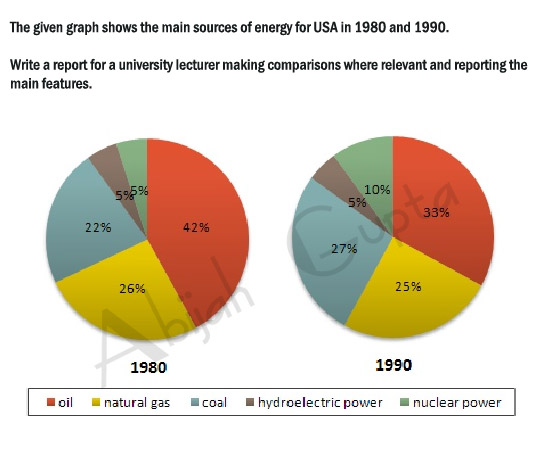
You must paraphrase the information given at the top of the charts “The graph shows the main sources of energy for the USA in 1980 and 1990”. You cannot copy this, you must use your own language.
Tips
- the graph = the pie chart
- shows = illustrates
- main sources of energy = energy production from different sources
- for the USA = don’t change this
- in 1980 and 1990 = in two different years (1980 and 1990)
Try writing your introduction before checking the model answer. Model Answer
Overview
The overview contains the key features of the charts. Answer the questions below to find the key features.
- What was the main source of energy in 1980?
- What was the main source of energy in 1990?
- Which produced the least energy in 1980?
- Which produced the least energy in 1990?
- Did the amount of energy produced by each source change a lot or just a little between the years?
- Did all types of energy increase by 1990?
Now write your overview before you check the model. Model Answer
Body Paragraph 1
This paragraph will give details about oil and hydroelectric power, which we highlighted in the overview above.
Tips
- You will need to write one sentence about oil comparing the percentage each year and then one sentence about hydroelectric power comparing the years.
- You must add data (percentages and dates) to support each sentence
Here are two example sentences. Fill in the gaps with the right words.
The amount of energy produced by oil in the USA 1. ………………. 42% in 1980 and this, then, 2. ………………….. to a third (33%) in 1990. The proportion of energy from hydroelectric power, 3………………, remained constant in both years ………a mere 5%. Answers
- accounted for / comprised of / made up / was
- fell / declined / dropped / went down / decreased
- on the other hand / by contrast / in contrast ( we use a linker to highlight that this is opposing information to the previous sentence)
- at
Body Paragraph 2
This paragraph will give detail about the other sources of energy in the pie charts.
Tips
- which sources increased?
- which sources decreased?
- what were the percentages for each source?
Again, fill in the gaps in these model sentences.
The energy generated by natural gas, which was the second 1. …………… source of energy in the USA in 1980, fell 2. ………. 1% to a quarter of all energy produced in 1990. In contrast, production by coal 3. ……………… from 22% to 27% in 1990 4. …………….. there was a 5% rise in energy from nuclear power to reach 10% in the second year. Answers
- largest / major
- by (this is used when writing about differences in amounts)
- increased / rose / went up / climbed / grew
- while / whereas
Recommended Lessons
IELTS PIE Chart Model
Practice Writing Task 1 Charts


Hey Teacher,
First, I want to thank you endlessly for your efforts. Your lessons are useful. Please favour me with a small check to my essay for the example above.
The pie graphs illustrate different sources of energy production in the USA ( oil, natural gas, coal, hydroelectric power and nuclear power ) in the years 1980 and 1990.
Overall, at the beginning of the period the amount of energy produced from oil was the largest segment while coal and hydroelectric power made the lowest production. In comparaison, at the end of the period oil made up the biggest part of the chart as well. Meanwhile, production by hydroelectric power was the least significant of the main sources of energy for the USA.
The energy generated by coal accounted for 22% of the main sources of energy for USA in 1980 and had a moderate growth of 5% in 1990. That produced by nuclear power was 5% in the beginning of the period and experienced a twofold increase to one-tenth in the end of the period.
Energy from oil which comprised almost a half of the general energy produced in 1980, fell to 33% in1990. Furthermore in 1980, energetic outputs from natural gas ere at 26% and decreased slightly by 1% to a quarter of the main energy produced in 1990. However, the proportion of energy produced from hydroelectric power remained constant in both years at 5%.
Thanks Liza
Hello, Liz!
I can’t help leaving a comment to express my gratitude and appreciation for your example. It makes it simple to teach how to write a report by merely following several steps.
Best wishes for you!
I’m so pleased it was useful 🙂
Hello Liz!Thank you very much for vivid explanation and clear ideas and clues about this type of task 1!I always was scared with pie-chart,but now im realised how to deal with them.Thank you!❤💕💗😘
I’m so glad you are more confident now. It’s just a matter of becoming more familiar with it all and have a clear approach 🙂
my exam is tomorrow and I’ve finally got the hang of the writing task 1. Thank you Liz!
I do think my answer is a little verbose.
Good luck tomorrow! Keep your eye on the clock and manage your time properly.
Hi Liza
thank you for your great page and priceless information.
Thank you so much mam
Lots of love from Nepal😍😍
This was the best lesson and the best way to explain how to write a pie chart.Thank you so much Liz.
Hey Liz!!
You are doing a great job. Your tips are really useful and your efforts are remarkable.
Hi Liz, you doing so good. thank you.
but just a quick one, please are there no conclusion in writing task 1?
See the tips on this page: https://ieltsliz.com/ielts-writing-task-1-lessons-and-tips/
It was very easy to understand .thank u so much!!!
Thank you so much for your help while preparing for IELTS examination
hi liz
thanks a lot for your guidance.
regards,
Raj
What about General Statement before Overview?
Is general statement needed?
Please tell me the difference between General Statement and Overview
I am confused about these
See full model answers for writing task 1 on this page: https://ieltsliz.com/ielts-writing-task-1-lessons-and-tips/
Hello teacher, In IELTS writing task 1 in the overview can I use superlatives like( the highest, the least)
Yes, it is the only way to highlight some key features.
hi mam, could you pls tell me whethr every graph should contain overview..2 nd sentence start with overall…
All writing task 1 should have an overview for the academic test.
Hi Liz,
Cambridge ielts-11 has got a question (practice test 1) about pie chart, I am a bit confused about the tense I should use there, as no date is mentioned. would you instruct me, please?
The task is // The charts below show the percentage of water used for different purposes in six areas of the world. Summarise the information by selecting and reporting the main…….//
Regards
If not date is given, you should use the present tense.
It’s so helpful . Thanks a lot
Hi Liz,
Is all of the pie chart exams double, or it’s just an example?
can you give me a link of one pie chart only
You won’t get only one pie chart. But you might get one pie chart with a table, for example. You can also get two pie charts, three or four.
liz only you can change my life. i will meet you after 6 years. its my promise.
Hello, Liz. I really get Pleasure from your lessons…
Thanks Liz for your great effort, actually your support is invaluable
God bless you.
Hi Liz,
You ‘re doing a great job. Your methods are easy to follow and consistent.
Thank you.
I’m glad you find my blog useful 🙂
thanks mam for ur lessons.
Hello, I was paid attention to your classes in youtube when I was prepared to the ILETS tests.
I was writing this essay before the test day.
The pie graph illustrates that dominant energy sources used in USA are oil, natural gas,coal, hydroelectric power and nuclear power in 1980 and 1990.
Overall, it is obvious that oil, natural gas, and coal is the most popular energy sources among the five major sources in USA during this decade. And the least popular energy sources are hydroelectric power as well as nuclear power. (it would be better to write both most and least popular ?)Besides, the oil and coal show have the biggest fluctuations compared with the rest of the others at this period.
The primary energy source is oil which comprised of 42% in 1950, while it faced a strongly decreases of 9% to 42% in 1990. The dramatical fluctuations of oil are significant differences from the slight changes of natural gas and coal, the usage of natural gas is declined from 26% to 26% slightly, which is mere 1% decrease 10 years later. Coal is the only energy sources which increased from 22% to 27% among this three types of major energy sources. in 1990 and 1990.
With regards to the remaining usages of least popular energy sources, there is 5% growth in nuclear power (5% in 1980 and 10% in 1990 respectively). The hydroelectric power is the only energy sources stay the same as the original(5%) among this five major energy sources in USA over the decade.
Kindly give me your advice and mark this essay.
Best Regards,
Jane
Sorry, Jane, but I don’t comment on writing.
hi liza madamgreeting for the day. which specific tense can be used for describing pie chart?
You look at the dates given and use the appropriate tense.
Hey Liz !!
I am getting confusion where to use commas and other indications. can you please help me out to use these type of indications.
Please google “English punctuation” to learn about that.
Hi Liz
May I know do we need to include a comma before “while” / “whereas” ?
Yes, there should be.
And if a graph and a table is given, for the overall view, do we only mention what are the highest/largest? I’ve seen many examples but all of them only mention about the highest.
Thank you!
When you have a lot of data, for example with two charts or a graph and a table, you need to make a decision about how much information you put in the overview. Of course the key features are usually the highest and lowest but you must decide if you want to include them both. You are being marked on your ability to select information.
Hii Liz I m from india. I like your site very much and I learnt a lot from your site. my exam is on 18 june. wish me luck
Good luck!!
Hi madam, hope you are doing well.
Would you mind giving your precious opinion on the following pie charts,
The supplied pie charts illustrate information about the comparison of the US spending patterns from 1966 to 1996.
The two stuffs on which the US highly spent in two different years were food and cars. They expended 44% on food and 23% on cars in 1966 but, the calculation almost reversed whereas, the expenditure on food fell down at 14% and it extended up at 45% on cars back in 1996.
On the other hand, the US spent 7% on restaurants in 1966 but, such expenditure got a growth that marked double of it, 14% back in 1996. Similarly, spending on computers was only 1% in 1966 but they gave a bit importance on it as the expenditure augmented up at 10% in 1996.
As opposed to, the expense on petrol had little difference between 1966 and 1996. Besides, furniture took 11% of their expenditure in 1966 but, it plunged by 2% in 1996. Moreover, it seems American lost their interest in books as they spent less on it than the other stuffs in two different years. The expenditure on book was 6% in 1966 whilst, it got the lowest point, 1% back in 1996.
Overall, it can be summarized that according to the US spending patterns, they spent much of their expenditures on food and cars than the rest of the stuffs between 1966 and 1996.
Hello Liz came across this question
Today in many countries old people are given insufficient respect.
What is the reason?
What problems can this bring in society?
Now in this case how do u answer a discussion or an opinion?kindly advise thanks.
You answer the questions. You give the reasons and you explain the problems.
Dear Liz:
Just a question, Why did you write about Oil and Hydroeletric power in paragraph A, and the others forms of energy in Paragraph B?
What is the logical order?
thank you so much
The overview explains the logic: …oil constituted the main source of energy production in both years while hydroelectric power produced the least energy. That means the two key features are put in one paragraph.
hi liz
Is this introduction can be correct?
( the pie chart illustrate the various shapes of energies in the USA during two years.(1980 and 1990))
https://ieltsliz.com/liz-notice-2015-2016/
hi liz thanks a lot for your wonderful work.i am really thankful to you because i am learning so much from your lessons and i think you have the best teaching techniques so far .i am planing to take my exam in the next few weeks .wish me best of luck.
regards
Good luck!
in overall why you say” whereas an increase ” instand increased ?
I wrote “whereas an increase can be seen” which is fine.
All the best
Liz
good day mam Liz, im confused on putting words in a “Colon”. Does it only count as 1 word? even with 3 words inside the colon. thanks
You don’t use colons. You can use brackets. All words are counted.
Liz
The pie charts illustrates the five different sources of energy (oil,natural gas,coal,hydroelectric & nuclear power) for USA in two two different years (1980 &1990).
over all ,oil was the main source in both years, however there was slight fluctuation in the nuclear power and furthermore there was uptrend in coal source and a small decrease in natural gas.
In 1980 the major source of energy in the USA was oil which comprised of 42% but in next decade (1990) it decline to 33% although, it remain main source for both two periods
The second largest source of energy was natural gas and proportion of natural gas was slightly reduced from (26% to 25%) in 1990.Moreover the percentage of hydro electric remained constant in both years.
The coal was the third major source of energy in the USA which rose from ( 22% to 27%) in 1990.However there was also a rise of 5% in the energy of nuclear power which reached about 10% in 1990.
Dear Liz,
Thank you very much for your website. It helps me so much!
One of the sentence in this lesson confuses me. In body paragraph 2, you wrote that “production increased from 22% to 27%”. But I looked for the dictionary and googled, I cannot find this usage. As far as I know, the word “increase” can be used in two ways: increases from number A to number B; or increases by xx%. Is this “increase from A% to B%” correct or just a typo?
Thank you very much.
It can be used with either numbers or percentages. It is correct. The preposition “by” refers to the difference. For example “It increased from 22″ to 27”. Or “It increased from 22% by 5%”.
Liz
Thanks for your reply. ^_^
Hi liz, You video and tips are too much helpful for me. But i am in confusing situation to write task 1 when it comprises two more graph (such as it comprises with bar, line, & pie chart). How can i complete this task easily? Pls give me some suggestions. I am waiting for your response. finally thanks for your excellent tips and videos.
Introduction both, put key features for both in an overview and then put the details of each in separate body paragraphs. See my model writing for two charts.
All the best
Liz
dear, thanks for your response. if you able pls give me more model answer for exercise. i think it will be very helpful for me.
regards
sahed
Dear, I need a model answer that contains 3 charts. pls help me and give a link to exercise. sahed
Sorry I don’t have that available at present.
Liz
All models have been posted. I don’t have more at present.
Liz
Can we change the structure to talk about 1980 trend in paragraph A and 1990 trend in paragraph B?
If you use that structure, you wouldn’t be comparing. These two pie charts need to be compared.
All the best
Liz
Actually, when I wrote about 1990 in paragraph B I mentioned what are the changes in the percentages and compare them with that in 1980 .
Thanks Liz for your valuable post.
I have a question- In paragraph A you mentioned “………..dropper to a third(33%) in 1990.
For another data If i use to a half(50%) or to a three forth(75%).
Is it ok or not? If not why?
Thanks in advance.
Yes, absolutely. You can use these phrases for pie charts.
All the best
Liz
Thanks a lot!!!
Hi liz, Thank you for your terrific lesson here in your blog site, it helps me a lot for my incoming exam this oct…
Can you please kindly check my overview if this still a good format… Please include an advice…
Overall, Oil was the major source of power generation in both years in the USA, in contrast to hydroelectric power which had the lowest share of energy. Meanwhile natural gas and coal both constituted for approximately a quarter in two given years.
Thanks you in adv.
I’m sorry but I don’t give feedback on writing.
All the best
Liz
Sad, however, thank you for your time, keep up the great work…
Ms. Liz
So will there be 4 paragraphs? Or overview is included in PAragraph A?
Please see the structure and paragraphs lesson on this page: https://ieltsliz.com/ielts-writing-task-1-lessons-and-tips/
Liz
hello liz,
thank you for your website..
my doubt is,how can be oil in a 3rd position as a source in the latter year.Though it plunged ,it was the major source of energy in the second year.
Very easily if you look at the second pie chart. Whether it increases or not, the majority is proportional to the others.
Liz
Thank you very much for the clear and helpful lesson.
Hi Liz,
In the overview, it says “there is a slight decrease in production from oil…”. But the pie chart shows a drop from 42% to 33%. Comparing to other resources, this is the biggest change. Why do we choose to say “slight decrease”?
Thank you,
Xue
Regardless of other decreases, it is still only slight.
All the best
Liz
Well.. How do we define a “big” change? 30%, 50%, or 70%? I feel that this might be very arbitrary.
Thank you,
A big change may relate to the information and changes in the chart you have. It is all relative.
Liz
The pie chart gives information about the energy production from different sources, for USA in two given years{1980 and 1990}.
Please, do I paraphrased it accurately or not?
Kind regards,
Mubarak.
Sorry, I do not comment on writing. https://ieltsliz.com/posting-writing/
Liz
Hi Liz,i want to ask you about the correct methor of reporting facts n figures when there alot of variables.For example: The use of different fuel sources for energy production,in two different years,by two different countries.How shud we proceed with that kind os Task 1?shud we write one para about one country and describing the main trends in that country between two years.is it so?
Yes, that’s right. Because there is so much information, you need to oerganise your report logically and simply to help the examiner. As each country has two pie charts showing change over time, put one country in one body paragraph (showing the increases and decreases) and then put the other country in a separate body paragraph. Paragraphing is all about logic.
Liz
ok thanku so much:)
Hi Liz 😀
Can I explain both the charts separately in 2 paras? Or do I have to combine and compare? I find it easier to explain separately but I’m not sure if that’s okay.
These pie charts show change over a period of two different years. Your task is to highlight and report the changes – increases and decreases. You don’t need to compare them in the body paragraphs, just report the increases and decreases with data (percentages).
Liz
Hi Liz,
What word can be substituted for the word “part”? [like the largest “part” of the pie chart is oil] I only know several but still don’t know if they are correct: portion, respondent, percentage, rate, region
And with this prompt, is it a good idea to include these in the overall paragraph: largest part + smallest part + how nuclear power was one of the least but increased the most in those 2 years instead?
Unfortunately, the list you gave are not synonyms and can’t all be used. Firstly, you must look at the subject of the pie chart, lets take energy produced by fuel source. You can write “the main fuel source is” or “the largest amount of fuel was produced by oil” or “the majority of fuel was generated by …” or “oil was the predominate fuel source”. If your pie charts show fields of work, you can write “the biggest sector was” or “the main field of work was” or “the majority of people were employed in..”. The word “percentage” can always be paraphrased by “proportion” or “rate”. The word “region” only refers to geography (countries or areas).
Liz
Hi Liz
If they give us pie chart and bar chart together?
Have a look at this practice lesson: https://ieltsliz.com/ielts-charts-writing-task-1/
Liz
Hi mam..plz check my work…
The two pie charts depict the usage of main energy sources by the American people from 1980 to 1990 in five different grounds ( oil, natural gas, coal, hydroelectric and nuclear power)
At the first glance, the pie charts give a clear view that both in 1980 and 1990 coal was mostly used energy source in comparison to hydroelectric power and nuclear power in 1980 and only hydroelectric power in 1990, which were the least usage energy in USA. Furthermore, it is seen that coal and nuclear power utilization had been increased whereas oil and natural gas usage had been decreased from 1980 to 1990. But the hydroelectric power consumption remained stationary over the 10 period time.
Oil and natural gas utilization had been decreased by 9% and only 1% respectively in comparison to coal consumption which had been increased by 5% in 1990 from 1980.
In case of hydroelectric power, consumption was not changed in 1990 (5%) but nuclear power energy usage rose to 10% in 1990.
( took 18 minutes and contained apporx. 160 words)
Please read my notice about posting writing: https://ieltsliz.com/posting-writing/
All the best
Liz
Taking two different years(1980 and 1990, the two pie charts provide a background information on energy production for the USA from five different sources namely oil, natural gas, coal,hydroelectric power and nuclear power.
According to the data, the proportion of energy produced was 42% in 1980, but it it suffer a slight decrease in 1990 by 39%.The amount of natural gas also decreased from 26% to 25% in that time. The percentage of hydroelectric power produced remained stable(5%) in both years given.
Regarding nuclear power , there was a slight grown in it amount produced the figure standing at 22% in 1980 and 27% in 1990.However, the percentage of coal produced doubled from 5% in 1980 to 10% in 1990.
Overall, it is noticeable that the amount of oil produced is higher in both years whereas hydroelectric power produced the least energy.The percentage of natural gas decreased slightly(26% in 1980) by 25% ten years after.
That what I was able to do teacher. Please read it and help me to improve.
Please read my notice about posting writing: https://ieltsliz.com/posting-writing/
Thanks
Liz