IELTS Model Bar Chart Band Score 9

The model answer below is for an IELTS bar chart in writing task 1 of the academic paper. This model answer comes from the video tutorial I made, see the following link: Free Video Tutorial:  How to Describe an IELTS bar chart

IELTS Bar Chart

Bar Chart Model

Source: Bar chart above from unknown source.

IELTS Bar Chart Sample Answer

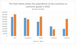
The chart illustrates the amount of money spent on five consumer goods (cars, computers, books, perfume and cameras) in France and the UK in 2010. Units are measured in pounds sterling.

Overall, the UK spent more money on consumer goods than France in the period given. Both the British and the French spent most of their money on cars whereas the least amount of money was spent on perfume in the UK compared to cameras in France. Furthermore, the most significant difference in expenditure between the two countries was on cameras.

In terms of cars, people in the UK spent about £450,000 on this as opposed to the French at £400,000. Similarly, the British expenditure was higher on books than the French (around £400,000 and £300,000 respectively). In the UK, expenditure on cameras (just over £350,000) was over double that of France, which was only £150,000.

On the other hand, the amount of money paid out on the remaining goods was higher in France. Above £350,000 was spent by the French on computers which was slightly more than the British who spent exactly £350,000. Neither of the countries spent much on perfume which accounted for £200,000 of expenditure in France but under £150,000 in the UK.

Comments: The report has been organised into logical paragraphs with flexible use of linking. The overview is very clear with key features well highlighted. Accurate data is used to support sentences in the body paragraphs. There is a range of complex structures and vocabulary which is used flexibly. This is an estimated band score 9 writing task 1 report for the academic paper.

Recommended

Main IELTS Pages

Develop your IELTS skills with tips, lessons, free videos and more.

IELTS Writing Task 1: Introduction Errors

IELTS Writing Task 1 Introduction Paragraph – learn what mistakes to avoid. The introduction should be short and factual based on the information given. It should also be the quickest part of task 1 for you to write. 

Look at the graph and introduction paragraph below. Then answer the questions.

comp-ownership-graph

Source: The above chart was not created by IELTS Liz.

Introduction Paragraph

Look at the introduction below and spot the mistakes.

Introduction: 

The graph give the information about the number of computer ownership by education level in two different years.

Questions:

  1.  How many mistakes are there in the introduction above?
  2. How would you write the introduction?

ANSWERS

Click below to reveal the answers and a model introduction.

Answers
  1. The graph = The bar chart
  2. give = gives (s)
  3. gives the information about = gives information about (no “the”)
  4. the number of = the percentage of / proportion of
  5. computer ownership by education level = copied from graph. Do not copy phrases from the question paper. You can use the words, but change the order or paraphrase where possible.
  6. in two different years = always provide full information. Give the precise dates
Model Introduction

Model Introduction

The bar chart gives information about the proportion of people from five different levels of education who owned a computer in two different years (2002 and 2010).

Model Introduction Comments: As you can see, the first words are not altered because they are not required to be paraphrased. A bar chart is a bar chart. However, the verb is paraphrased and the rest of the information is reworded. As the education levels are length to write, it is possible to give information about how many there are in your introduction. Regarding dates, you can use brackets in IELTS Writing Task 1 and you can see that the dates are given in the brackets in this introduction. 

.

Subscribe to get New Posts by Email

IELTS Writing Task 1 Answer 2017

Below is an IELTS writing task 1 answer for 2017. The bar charts were reported by a student in February 2017 and recreated as accurately as possible. Please remember that IELTS do not release question or answers for each test. So, all reported tasks and questions are from students who have recently taken the test and have recreated their questions.

You can find links to more model answers for writing task 1 on this page: IELTS Writing Task 1, model answers & tips

IELTS Writing Task 1 Bar charts 2017

Download the above writing task 1 as pdf: IELTS 2017 Writing Task 1

IELTS Writing Task 1 Answer 2017

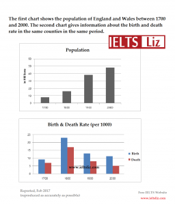
The two bar charts illustrate the population growth as well as the birth and death rates in England and Wales between 1700 and 2000. The population is given in millions, while the birth and death rates are per 1000 people.

Overall, there was a dramatic increase in the population of England and Wales over the 400 years. The birth and death rates initially witnessed a growth but then steadily declined over the period given. The birth rate was constantly higher than the death rate over the period given.

The population of England and Wales stood at under 10 million in 1700 which then doubled to around 15 million in 1800. By 2000, the figure had reached a high of almost 50 million, almost 5 times that of the population in 1700.

The birth rate was just under 10 per 1000 in 1700 and rose dramatically to peak at over 20 per 1000 in 1800 before dropping to slightly over 10 in the final century. The death rate showed a similar trend but was between 5 and 10 per 1000 less than the birth rate at all times.

187 words (I have put the word count for you. You shouldn’t do this in the test.)

Would you like to see more model answers for writing task 1? See the main pages below and click on IELTS Writing Task 1

Main IELTS Pages

Click to see more tips and practice lessons for IELTS:

Answer for IELTS Writing Task 1 2016

The IELTS model answer below is for a recent IELTS writing task 1 which was reported in early 2016. The two pie charts and bar chart are illustrated beneath the report. Further down the page, you will also find examiner comments and a download link for this model answer and task. Also note the useful links provided for more IELTS writing task 1 lessons. This is for the IELTS writing task 1 academic test.

IELTS Model Answer, Reported 2016

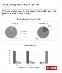
The pie charts give information about how the world’s water is distributed, whereas the bar chart illustrates the percentage of water used in agriculture, domestic use and industry in three countries (Egypt, Saudi Arabia and Canada).

Overall, salt water makes up an overwhelming majority of the world’s water. Fresh water is made up of mainly water from ice and glaciers. While most water in Egypt and Saudi Arabia is used for agriculture, in Canada it is predominantly used for industry.

The pie charts show that 97% of global water is salt water compared to a mere 3% which is fresh water. Water from ice and glaciers accounts for 79% of all fresh water as opposed to ground water and surface water (20% and 1% respectively).

In terms of the use of water, both Egypt and Saudi Arabia use almost 80% of their water for agriculture in comparison to domestic usage and industry which account for approximately 15% and 10% respectively. The reverse is seen in Canada where only 10% of water is used for agriculture and domestic purposes in contrast to industry, which uses 80% of water in Canada.

Words = 189

IELTS Writing Task 1 Charts Jan 2016

Download this writing task 1 with model answer: IELTS Writing Task 1 Charts & Model 2016

Examiner Comments:

The information is well organised into logical paragraphs. The overview paragraph contains the key features of all charts. Information is accurate and no irrelevant information is given. There is a flexible range of linking devices for showing comparisons. Vocabulary is well used and this report contains complex sentence structures.

Recommended

Reported IELTS Writing Task 1 Charts for January 2016

The IELTS writing task 1 charts were reported on January 9th by two students (Kirush and Adam). This shows two pie charts and a bar chart illustrating world water distribution and usage. Follow the link for a model answer to the 2016 IELTS writing task 1 below.

Reported IELTS Writing Task 1 Jan 2016

Download the PDF file for the charts below: Recent IELTS Writing task 1 2016

IELTS Writing Task 1 Charts Jan 2016

Model Answer for above charts

Other Pages for IELTS:

Click to view page:

Main IELTS Pages

Develop your IELTS skills with tips, lessons, free videos and more.
IELTS Line Graph and Bar Chart Model Answer (Band 9)

An IELTS line graph and bar chart model answer with examiner comments. Describing two charts together for IELTS writing task 1 academic paper is easy when you know how.

IELTS Line Graph & Bar Chart

The line graph shows visits to and from the UK from 1979 to 1999. The bar chart shows the most popular countries visited by UK residents in 1999.

Source: IELTS Cambridge English Test Books

ielts-Line-and-bar-graph


Line Graph & Bar Chart Model Answer

The line graph illustrates the number of UK residents going abroad from the UK and overseas residents visiting the UK between 1979 and 1999, while the bar chart gives information about how many UK residents travelled to five of the most popular countries in 1999. Units are measured in millions of people.

Overall, there was an increase in the number of visits to and from the UK and there were more visits abroad by UK residents than visits to the UK by overseas residents over the period given. Furthermore, the most popular country to visit by UK residents was France in 1999.

The number of UK residents visiting overseas  began at just under 15 million in 1979 and rose significantly to reach over 50 million in 1999. Around 10 million overseas residents visited the UK in the first year before climbing steadily to just under 30 million by the final year.

In 1999, France was visited by over 10 million UK residents, followed by Spain at approximately 9 million. The USA and Greece had about 4 million and 3 million visitors respectively. The least popular country visited was Turkey which had only about 2 million UK residents going there.

Examiner Comments

This IELTS writing task 1 report describing both a chart and a graph is organised into logical paragraphs. The introduction introduces both charts and the overview contains the key features of both chart. Detail in the body paragraphs is supported by data. The right language is used for the line graph and there are a range of sentence structures used throughout.

Paraphrasing

  • shows = illustrates / gives information about
  • the number = how many
  • visits abroad by UK residents = UK residents going abroad = UK residents travelling to…
  • from 1979 to 1999 = between 1979 and 1999 = over the period given
  • rose = climbed
  • about = approximately = around

Recommended

IELTS Writing Task 1: Tips, Lessons and Model Answers


Main IELTS Pages

Develop your IELTS skills with tips, model answers, lessons, free videos and more.
IELTS Bar Chart: Tips for a High Score

Learn how to describe an IELTS bar chart by following the tips and techniques in this video lessons. This lesson is 100% vital for all IELTS candidates doing writing task 2 academic paper in 2018.

You must learn:

  • how to write an introduction
  • how to identify key features
  • how to write an overview
  • if there is a conclusion or overview
  • how to organise the body paragraphs
  • how to write complex sentences
  • tips to avoid getting a low score
  • how to get a high score
  • bar chart model band 9

IELTS Bar Chart Tips Video Tutorial

This video lesson shows you how to tackle an IELTS bar chart for writing task 1 (academic paper).

IELTS Bar Chart Essential Tips

Below are useful tips for an IELTS bar chart.

1. Introduction Paragraph

Keep your introduction paragraph simple. Just paraphrase the information given by IELTS. It is usually just one sentence. It is possible to also comment on the units of measurement in the chart “Units are measured in …”.

2. The overview

Look at your bar chart and choose the key features. These might be highs, lows, main differences etc. Collect them together and present them in an overview. To learn more about the overview / conclusion debate, please see my IELTS Overview Video Lesson. You must remember that the examiner is looking for the overview and it is an essential part of your Task Achievement mark. That criterion is 25% of your marks.

3. Body Paragraphs

Make sure you have more than one body paragraph. The usual is two body paragraph. Decide how you will divide the information in the bar chart into difference body paragraphs. You must organise your paragraphs into a logical order.

4. Support Sentences with Data

Your body paragraphs must have numbers to support them. If you fail to have numbers with your sentences in the body paragraphs, you might get only band 5 in Task Achievement. To learn useful vocabulary for using data accurately, see my lesson: IELTS Vocabulary: Accurate Data.

5. Complex Sentences

You must write your task 1 using a range of complex sentences. You must learn these sentence structures. The best way is from model answers: IELTS Writing Task 1 Model Answers.

6. Linking devices

You should use a range of linking devices. For example, while / whereas / as opposed to / compared to / in comparison with. All these will help you get a higher score in Coherence and Cohesion which is 25% of your marks. Make sure you use them correctly.

7. Assessment Criteria

Learn more about what the examiner wants to see in your writing. You must understand the requirements for the band score you are aiming for. See this page to learn about IELTS Writing Task 1 Band Scores 5 to 8 Explained.

 Recommended

Main IELTS Pages

Develop your IELTS skills with tips, model answers, lessons, free videos and more.

Pie Chart and Bar Chart for IELTS Writing Task 1

It is possible to be given two charts together in IELTS writing task 1. Below you will see two pie charts followed by a bar chart. This exercise will focus on how to structure your report and how to highlight the key features of both charts in one overview.

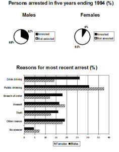
The charts below show the males and females arrested over 5 years and the reasons for the most recent arrests.

two IELTS charts

Source: The above charts were not created by IELTS Liz.

Two Charts: Structure and Overview

Answer the questions below in order to decide your paragraphing for your task 1 report.

  1. Will you put the introduction separately?
  2. Will you have an overview or conclusion?
  3. How many body paragraphs will you have?
  4. What order will you put your paragraphs in?
  5. Will your body paragraphs be equal lengths?

Answers

  1. Yes, the introduction should go in a separate paragraph.
  2. You must have an overview not a conclusion. The overview can go after the introduction.
  3. You should have 4 paragraphs in total.
  4. You should have an introduction, an overview, one body paragraph for the pie chart detail and one body paragraph for the bar chart detail.
  5. The body paragraph with pie chart detail will be shorter than the body paragraph with details about the bar chart


Now write your overview. this paragraph must contain key features from both charts. This means you must write one sentence about the key features of the pie charts and one sentence for the key features of the other chart. After you have written your overview, check the sample overview. Model Overview

Overall, over the five year period finishing in 1994, there were significantly more males arrested than females. The majority of arrests were due to public drinking while no answer was given for the least number of arrests for both genders.


Recommended

error: Content is protected !!