IELTS Line Graph Model (Band Score 9)

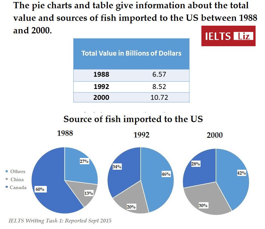
This model line graph for IELTS is estimated at band score 9. The model answer below is for IELTS writing task 1 academic paper. Use this sample writing as a template for structure, key features and language for any IELTS line graph. There are also some tips given below to guide you and help you understand how to describe this type of graph.

IELTS Line Graph Sample Task

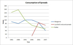
The graph below shows the consumption of 3 spreads from 1981 to 2007.

consumption of spreads line graph

Source: Graph above not created by IELTS Liz. Source unknown.

IELTS Line Graph Answer

The line graph illustrates the amount of three kinds of spreads (margarine, low fat and reduced spreads and butter) which were consumed over 26 years from 1981 to 2007. Units are measured in grams.

Overall, the consumption of margarine and butter decreased over the period given, while for low fat and reduced spreads, it rose.  At the start of the period, butter was the most popular spread, which was replaced by margarine from 1991 to 2001, and following that low fat and reduced spreads became the most widely used spread in the final years.

With regards to the amount of butter used, it began at around 140 grams and then peaked at 160 grams in 1986 before falling dramatically to about 50 grams in the last year. Likewise, approximately 90 grams of margarine was eaten in the first year after which the figure fluctuated slightly and dropped to a low of 40 grams in 2007.

On the other hand, the consumption of low fats and reduced spreads only started in 1996 at about 10 grams. This figure, which reached a high of just over 80 grams 5 years later, fell slightly in the final years to approximately 70 grams in 2007.

Tips for Line Graphs

  1. Paraphrase the line graph information for your introduction.
  2. Put main trends and any other key features in an overall statement.
  3. Make sure each body paragraph sentence has numbers and dates to support it.
  4. Check the video lesson below to learn how to write a complex sentence for an IELTS line graph report.
  5. Practice!! Click here: Practice Line Graphs to get a selection of sample line graphs to practice writing for your writing task 1 preparation.

Recommended Tutorials

……………………………………..

………………………………

Subscribe to get New Posts by Email

IELTS Table & Pie Charts Model 2019

The IELTS table and pie chart below was reported in May 2019 and also in September 2015. The topic is the imports of fish to the US from various countries and the value of these imports.

Note: The writing task 1 below is a reproduction of the original IELTS task 1 by an IELTS candidate. This means details will vary from the original. Even so, it gives a great chance to practise multiple tasks.

IELTS Writing Task 1: Table & Pie Charts 2019

IELTS writing task 1 (academic) reported 2019 and 2015.

IELTS Writing Task 1 Table 3 Pie Charts 2019

Model Answer: IELTS Table & 3 Pie Charts

Instructions: The following model answer has been divided into sentences (A-H). Put them in the correct order to find a band score 9 model writing task 1 report.

A) In terms of the source of fish importation, Canada supplied the overwhelming majority in 1988 (60%) compared to China and other countries which provided only 13% and 27% respectively.

B) Regarding the table, the value of imports started at $6.57 billion in the first year, increasing to $8.52 in 1992 and reaching $10.72 in the last year.

C) Overall, the value of imports rose by just under double over the period given.

D) Likewise, imports from China rose over the period to reach 30% in 2000.

E) At the start of the period, the US imported fish predominantly from Canada but, by the final year, other countries had become the main source.

F) Conversely, by 1992, other countries had replaced Canada as the main supplier and made up 46% of all imports in 1992 and 42% by 2000.

G) The table shows the value of fish that was imported to the US (measured in billions of dollars) in 1988, 1992 and 2000, while the three pie charts illustrate the amount of fish that the US brought in from China, Canada and other countries in the same three years.

H) The imports from Canada then proceeded to fall to 28% in the final year.

Answers for Model Answer 2019

Click here to reveal answers: Answers

Answer: G C E B A H F D

See the model answer below to check how the above information is organised into paragraphs.

IELTS Model Answer: Table & 3 Pie Charts

The table shows the value of fish that was imported to the US (measured in billions of dollars) in 1988, 1992 and 2000, while the three pie charts illustrate the amount of fish that the US brought in from China, Canada and other countries in the same three years.

Overall, the value of imports rose by just under double over the period given. At the start of the period, the US imported fish predominantly from Canada but, by 1992 other countries became the main source.

Regarding the table, the value of imports started at $6.57 billion in the first year, increasing to $8.52 in 1992 and reaching $10.72 in the last year.

In terms of the source of fish importation, Canada supplied the overwhelming majority in 1988 (60%) compared to China and other countries which provided only 13% and 27% respectively. The imports from Canada then proceeded to fall to 28% in the final year. Conversely, by 1992, other countries had replaced Canada as the main supplier and made up 46% of all imports in 1992 and 42% by 2000. Likewise, imports from China rose over the period to reach 30% in 2000.

Examiner Comment: Vocabulary is accurate and flexible. Paraphrase for the topic vocabulary =fish importation, provided, supplied, suppliers. Please note that the topic vocabulary provided by IELTS was also used and this is fine. Sentences are complex and accurate. The writer offers a good range of sentence structures and linking words (while, overall, regarding, in terms of, compared to, likewise, on the other hand). The overview statement is easy to find and contains the key features for both table and charts. Details are well organised into logical body paragraphs. It is fine that body paragraphs are not of equal length in report writing. This is estimated at band 9.

.

More IELTS Writing Task 1 Model Answers:

Click here to access more writing task 1 model answers and tips and free lessons: All IELTS Writing Task 1 Free Lessons etc

Note: GT candidates are not given such tasks. GT writing task 1 is a letter only. Click here: Essential Tips for IELTS GT Letter

IELTS Writing Task 1: Pie Chart Model Score 9

How to compare two pie charts in IELTS writing task 1. This sample answer illustrates the method of organising the report as well as useful language and sentence structures to get a band score 9.

IELTS Pie Charts

The pie charts below show the comparison of different kinds of energy production of France in two years.

ielts pie chart comparison

Source: Above pie charts not created by IELTS Liz.

Pie Chart Sample Answer

The two pie charts illustrate the proportion of five types of energy production in France in 1995 and 2005. 

Overall, in both years, the most significant sources of energy  were gas and coal, which together accounted for over half the production of energy, while nuclear and other kinds of energy sources generated the least amount of energy in France. In all types of energy production there was only minimal change over the 10 year period.

Energy produced by coal comprised of 29.80% in the first year and this showed only a very slight increase of about a mere 1 % to 30.9% in 2005. Likewise, in 1995, gas generated 29.63% which rose marginally to 30.1% 10 years later.

With regards to the remaining methods of producing energy, there was an approximate 5% growth in production from both nuclear power and other sources to 10.10% and 9.10% respectively. Petrol, on the other hand, was the only source of energy which decreased in production from 29.27% in 1995 to around a fifth (19.55%) in 2005.

Pie Chart Tips

  • Always highlight the largest and smallest proportions
  • If there are two pie charts in different time periods, then you must highlight the key changes / trends
  • Use pie chart language – accounts for / comprises of / represents
  • The phrase “Units are measured in …” should be used when the units have not been stated in the previous sentence.

Recommended 

IELTS Writing Task 1: Tips, Model Answers and Video Lessons

IELTS Model Bar Chart Band Score 9

The model answer below is for an IELTS bar chart in writing task 1 of the academic paper. This model answer comes from the video tutorial I made, see the following link: Free Video Tutorial:  How to Describe an IELTS bar chart

IELTS Bar Chart

Bar Chart Model

Source: Bar chart above from unknown source.

IELTS Bar Chart Sample Answer

The chart illustrates the amount of money spent on five consumer goods (cars, computers, books, perfume and cameras) in France and the UK in 2010. Units are measured in pounds sterling.

Overall, the UK spent more money on consumer goods than France in the period given. Both the British and the French spent most of their money on cars whereas the least amount of money was spent on perfume in the UK compared to cameras in France. Furthermore, the most significant difference in expenditure between the two countries was on cameras.

In terms of cars, people in the UK spent about £450,000 on this as opposed to the French at £400,000. Similarly, the British expenditure was higher on books than the French (around £400,000 and £300,000 respectively). In the UK, expenditure on cameras (just over £350,000) was over double that of France, which was only £150,000.

On the other hand, the amount of money paid out on the remaining goods was higher in France. Above £350,000 was spent by the French on computers which was slightly more than the British who spent exactly £350,000. Neither of the countries spent much on perfume which accounted for £200,000 of expenditure in France but under £150,000 in the UK.

Comments: The report has been organised into logical paragraphs with flexible use of linking. The overview is very clear with key features well highlighted. Accurate data is used to support sentences in the body paragraphs. There is a range of complex structures and vocabulary which is used flexibly. This is an estimated band score 9 writing task 1 report for the academic paper.

Recommended

Main IELTS Pages

Develop your IELTS skills with tips, lessons, free videos and more.

IELTS Diagram: Model Answer Band Score 9

This IELTS diagram model answer is estimated at band score 9. It is possible to have a diagram in your IELTS writing task 1 academic paper. A diagram is also known as a process. The diagram shown below is from IELTS Cambridge Book 8, Test 3.

The diagram below shows the stages and equipment used in the cement-making process, and how cement is used to produce concrete for building purposes.

cement and concrete

  • Source: IELTS Cambridge English Test Book 8

Diagram Model Answer

The diagrams illustrate the way in which cement is made and how it is then used in the process of making concrete. Overall, limestone and clay pass through four stages before being bagged ready for use as cement which then accounts for 15% of the four materials used to produce concrete. While the process of making cement uses a number of tools, the production of concrete requires only a concrete mixer.

In the first stage of making cement, limestone and clay are crushed together to form a powder. This powder is then combined in a mixer before passing into a rotating heater which has constant heat applied at one end of the tube. The resulting mixture is ground in order to produce cement. The final product is afterwards put into bags ready to be used.

Regarding the second diagram, concrete consists of mainly gravel, which is small stones, and this makes up 50% of the ingredients. The other materials used are sand (25%), cement (15%) and water (10%). These are all poured into a concrete mixer which continually rotates to combine the materials and ultimately produces concrete.

Comments: This diagram gives a concise introduction. The overview contains key features of both diagrams and also highlights the connection between them. The body paragraphs are organised well and linking devices are used flexibly and accurately. Each body paragraphs explained the steps of each process in a logical order. Complex sentences are accurate and there is also passive voice used. Collocations are well used.

Recommended

IELTS Writing Task 1 Answer 2017

Below is an IELTS writing task 1 answer for 2017. The bar charts were reported by a student in February 2017 and recreated as accurately as possible. Please remember that IELTS do not release question or answers for each test. So, all reported tasks and questions are from students who have recently taken the test and have recreated their questions.

You can find links to more model answers for writing task 1 on this page: IELTS Writing Task 1, model answers & tips

IELTS Writing Task 1 Bar charts 2017

Download the above writing task 1 as pdf: IELTS 2017 Writing Task 1

IELTS Writing Task 1 Answer 2017

The two bar charts illustrate the population growth as well as the birth and death rates in England and Wales between 1700 and 2000. The population is given in millions, while the birth and death rates are per 1000 people.

Overall, there was a dramatic increase in the population of England and Wales over the 400 years. The birth and death rates initially witnessed a growth but then steadily declined over the period given. The birth rate was constantly higher than the death rate over the period given.

The population of England and Wales stood at under 10 million in 1700 which then doubled to around 15 million in 1800. By 2000, the figure had reached a high of almost 50 million, almost 5 times that of the population in 1700.

The birth rate was just under 10 per 1000 in 1700 and rose dramatically to peak at over 20 per 1000 in 1800 before dropping to slightly over 10 in the final century. The death rate showed a similar trend but was between 5 and 10 per 1000 less than the birth rate at all times.

187 words (I have put the word count for you. You shouldn’t do this in the test.)

Would you like to see more model answers for writing task 1? See the main pages below and click on IELTS Writing Task 1

Main IELTS Pages

Click to see more tips and practice lessons for IELTS:

Dec 2016 IELTS Writing Task 1 Sample Answer

Below is a sample answer for December 2016 writing task 1. The task  consists of one vertical bar chart and two pie charts. The sample answer is estimated at about band score 8.  The sample answer contains some grammar errors – can you find them? Answers below.

You can download a PDF copy of it at the bottom of the page. You can also find links to the main pages of IELTS tips at the bottom of this page.

December 2016, IELTS Writing Task 1

ielts-writing-task-1-reported-dec-2016

December 2016, Sample Answer

Estimated at band score 8

The bar chart and pie charts illustrate the percentage of people in Glasgow having three levels of education (university, school and those with no qualifications) in 2010. Information is divided into five age groups in the bar chart and by gender in the pie charts.

Overall, the majority of people with university education were in younger age groups, while in the oldest age group most people did not have any qualifications. The proportions of men and women were similar and showed little different between the levels of education.

The percentage of people with university education was up to 76% in the younger three age groups compared to only 50% in those ages 50 to 75 and just 25% in those over 75. This trend was reversed in those with no qualifications (9% in younger people rising to 72% in the oldest age group). The figure for those with school education was relatively constant at around 20% but was as low as 3% in the over 75’s.

The proportion of men and women in each level of education was around one third with only a slightly difference of 3% in university graduates as well as those who didn’t have educational qualifications.

Words = 198

There are a few grammar mistakes in this writing. Can you find them? Answers provided below

Download PDF Copies & Answers

IELTS Writing Task 1: ielts-writing-task-1-december-2016

December 2016 Sample Answer: model-task-1-dec-2016

Answers to Grammar Mistakes – click below to open:

Answers

Paragraph 2: in younger age groups = in the younger age groups

Paragraph 2: little different = little difference

Paragraph 3: in those ages 50 to 75 = in those aged 50 to 75

Paragraph 4: a slightly difference = a slight difference

Paragraph 4: didn’t = did not


Main IELTS Pages

Develop your IELTS skills with tips, lessons, free videos and more.


Answer for IELTS Writing Task 1 2016

The IELTS model answer below is for a recent IELTS writing task 1 which was reported in early 2016. The two pie charts and bar chart are illustrated beneath the report. Further down the page, you will also find examiner comments and a download link for this model answer and task. Also note the useful links provided for more IELTS writing task 1 lessons. This is for the IELTS writing task 1 academic test.

IELTS Model Answer, Reported 2016

The pie charts give information about how the world’s water is distributed, whereas the bar chart illustrates the percentage of water used in agriculture, domestic use and industry in three countries (Egypt, Saudi Arabia and Canada).

Overall, salt water makes up an overwhelming majority of the world’s water. Fresh water is made up of mainly water from ice and glaciers. While most water in Egypt and Saudi Arabia is used for agriculture, in Canada it is predominantly used for industry.

The pie charts show that 97% of global water is salt water compared to a mere 3% which is fresh water. Water from ice and glaciers accounts for 79% of all fresh water as opposed to ground water and surface water (20% and 1% respectively).

In terms of the use of water, both Egypt and Saudi Arabia use almost 80% of their water for agriculture in comparison to domestic usage and industry which account for approximately 15% and 10% respectively. The reverse is seen in Canada where only 10% of water is used for agriculture and domestic purposes in contrast to industry, which uses 80% of water in Canada.

Words = 189

IELTS Writing Task 1 Charts Jan 2016

Download this writing task 1 with model answer: IELTS Writing Task 1 Charts & Model 2016

Examiner Comments:

The information is well organised into logical paragraphs. The overview paragraph contains the key features of all charts. Information is accurate and no irrelevant information is given. There is a flexible range of linking devices for showing comparisons. Vocabulary is well used and this report contains complex sentence structures.

Recommended

error: Content is protected !!